There are countless small and medium sized businesses in B.C. and a majority of them are housed in our very own city of Vancouver. From world class restaurants to an innovative and leading startup community to locally owned retail stores in every neighbourhood, our city is exploding with unique interior and exterior commercial design to inspire.
Whether you’re situated in the historical and traditional Gastown or the innovative mixed-income False Creek area, there’s a million different ideas for how to design your space. Here’s just a few of our favourite commercial design ideas for Vancouver based companies:
Form Vs. Function

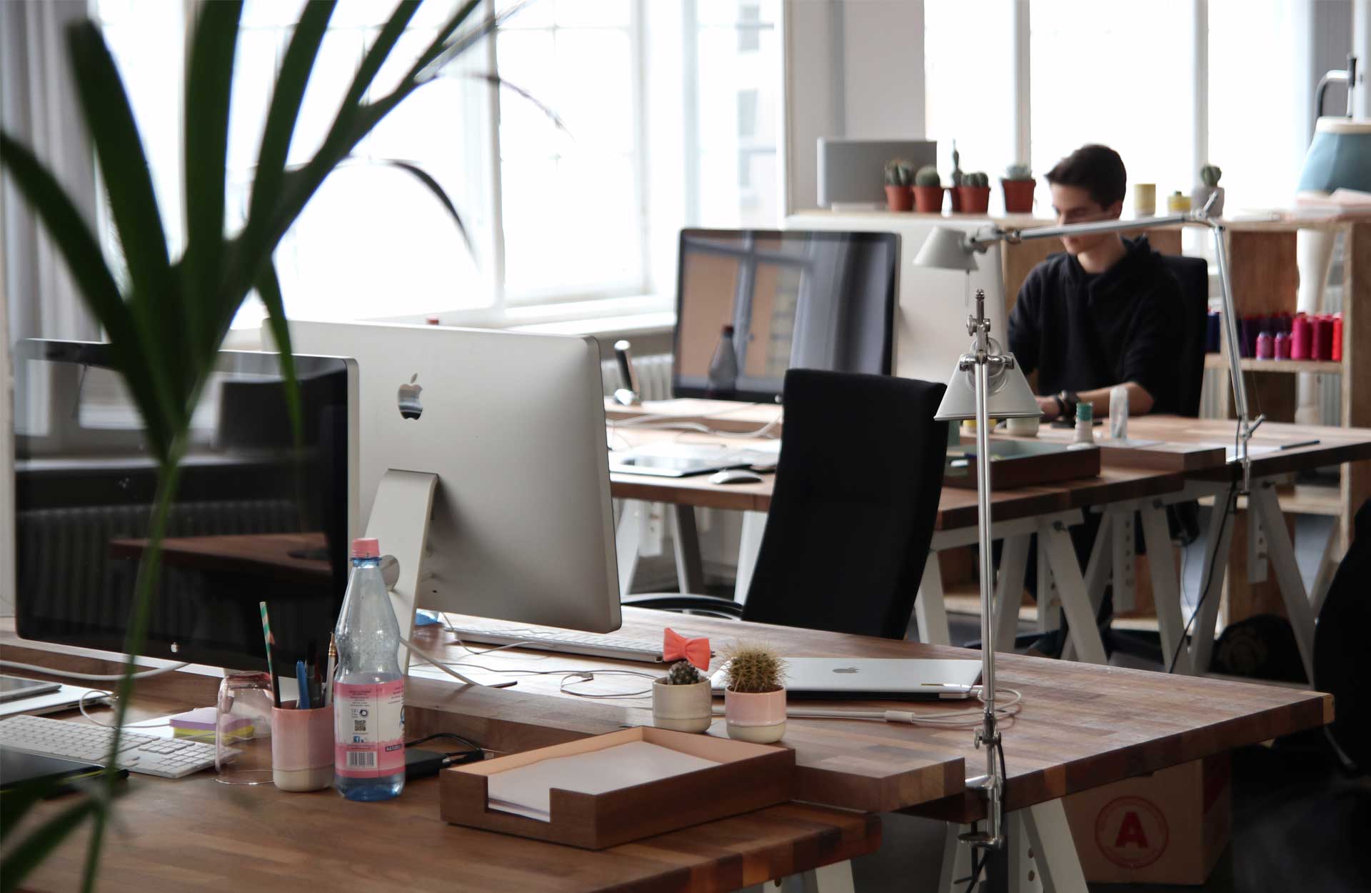
We’ve all seen the amazing spectacle that is a startup office in Silicon Valley. With the geometric designs, to large open spaces, it all seems a little crazy to imagine. But what should always ring true in any commercial space is that the design should focus on function over form.
Particularly in an office space, it’s important to remember that your employees will always appreciate a focus and investment in their comfort. From choosing seating that is both comfortable and appealing to ensuring that the space limits distraction, there’s a lot that should go into your design decisions. For the Vancouver based startup, we recommend straying away from “cool” or “trendy” designs and focus more on pieces and layouts that foster a good work environment.
Embrace The Theme

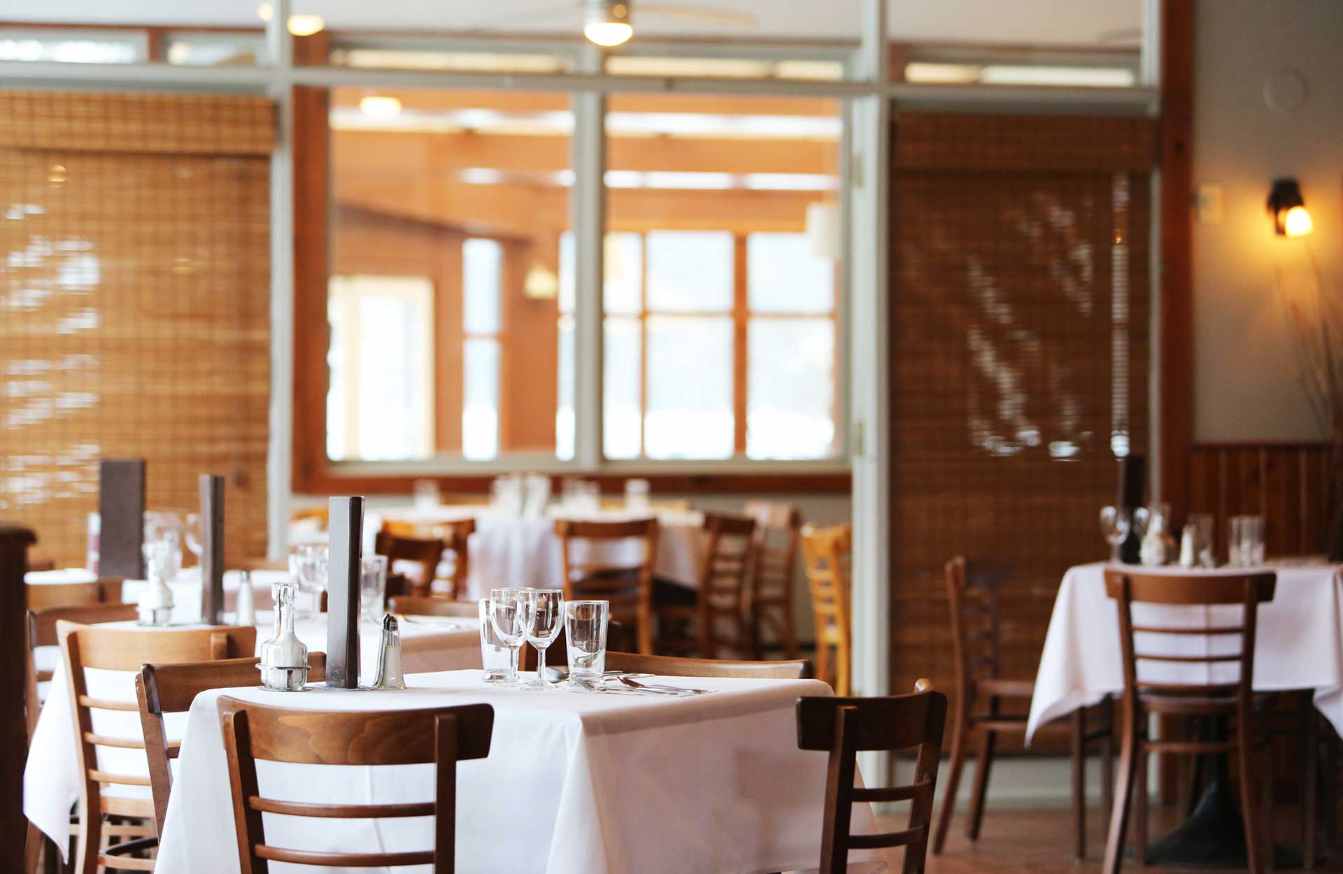
Especially important for restaurants, you want to make sure that the design of your space is indicative of the experience your food is offering. Just like presentation matters in cooking, so does the space they eat in.
This doesn’t mean going tacky – we know there’s a fine line between themed and over the top. If you’re a Mexican restaurant, make sure you’re going for colours inspired by the culture that are both bright but also classy. If you are Italian, go for dim lighting and cozy nooks for couple to enjoy their pasta in private. For Japanese inspired, look for clean lines and dark colours that will let the colour of fresh fish be the focus of the experience.
Get Scientific

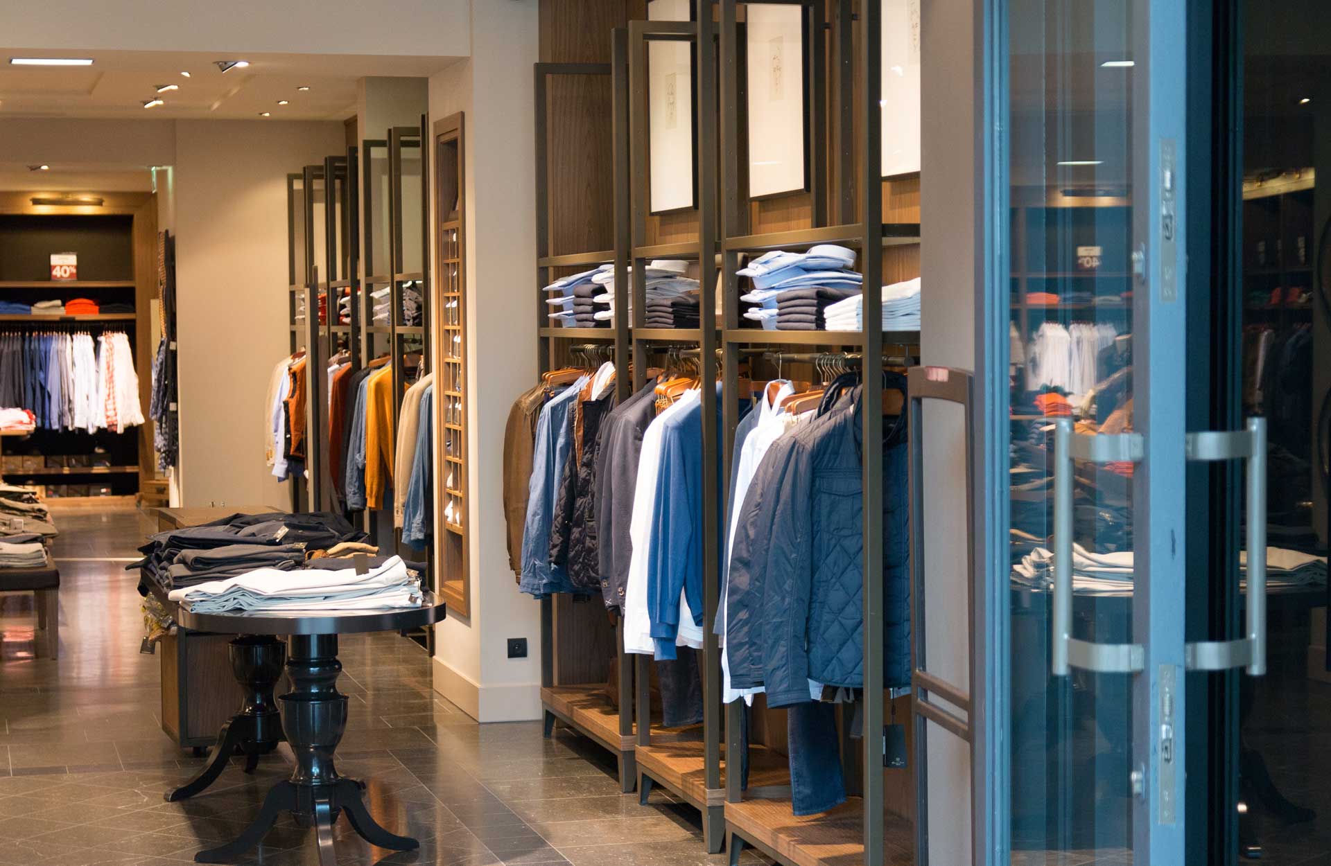
For retail companies, you’re never not thinking about how to get people to buy more. But did you know there’s a science behind a retail interior design too? It makes it that much more important to pay attention to how your space is laid out and how you’re giving the right environment for every customer or client.
Things like ensuring the “threshold” of your store – the first impression – perfectly exemplifies your brand, price, and offerings is very important. Because most people start with the right side of your store, you’ll want this side to be more compelling in design and layout. From there, you’ll want to design a natural path for your customers to walk throughout the store so you know exactly how they experience your product. All in all, design can make a huge difference in how each customer interacts with your store.
Have you seen any really cool commercial designs lately? Let us know in the comments!

